Plots.jl gallery#
Sources:
goropikari/PlotsGallery.jl (repo archived)
Attributes#
https://docs.juliaplots.org/stable/attributes/
using Plots
using Random
Random.seed!(2024)
Random.TaskLocalRNG()
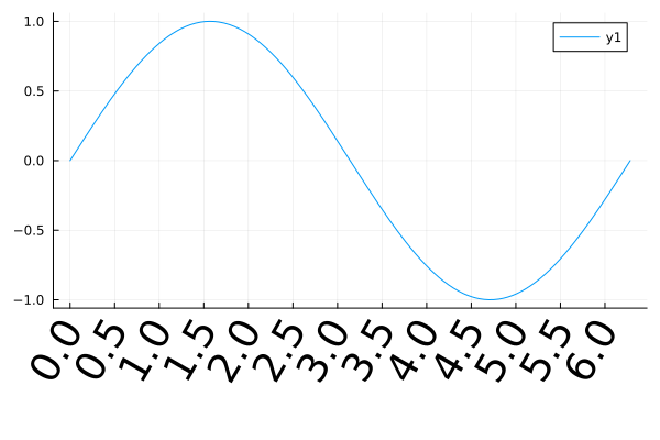
Ticks size and properties#
plot(sin, 0, 2π;
    xticks=0:0.5:2π,
    xrotation=60,
    xtickfontsize=25,
    bottom_margin=15Plots.mm)
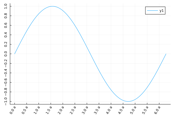
plot(sin, 0, 2π;
    xtick=(0:0.5:2π, ["$i a" for i in 0:0.5:2π]),
    ytick=-1:0.2:1,
    xrotation=60,
    yrotation=90,
)
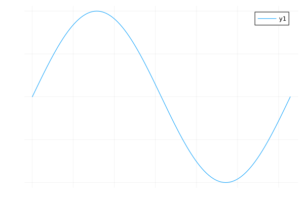
No axis#
axis=false
plot(sin, 0, 2π, axis=false)
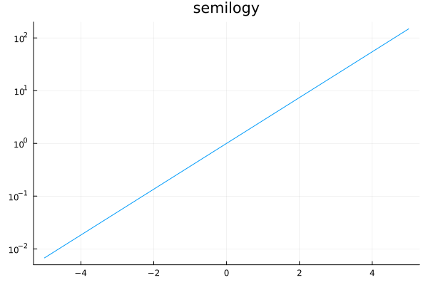
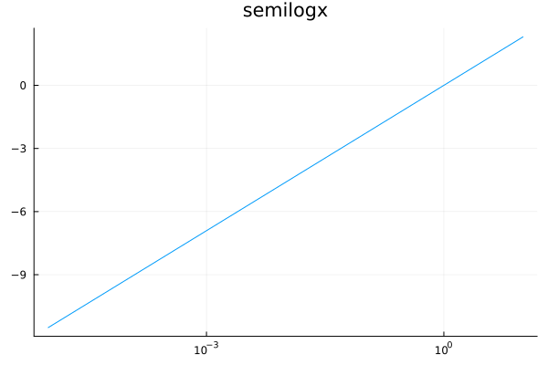
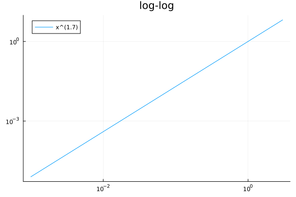
Log scale for axes#
xscale=:log10, yscale=:log10
plot(exp, -5, 5, yscale=:log10, title="semilogy", legend=nothing)
plot(log, 1e-5, 10, xscale=:log10, title="semilogx", legend=nothing)
plot(x->x^1.7, 1e-3, 3, scale=:log10, title="log-log", label="x^(1.7)", legend=:topleft)
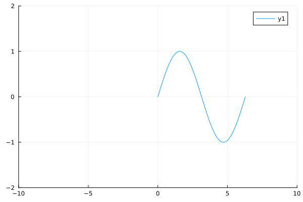
Axis range#
xlims and ylims
plot(sin, 0, 2π, xlims=(-10, 10), ylims=(-2,2))
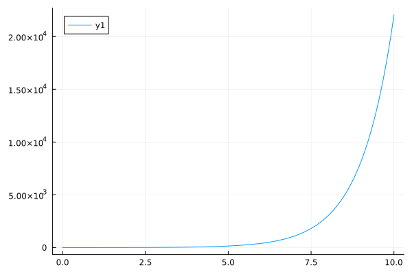
Scientific notation#
yformatter=:scientific
plot(exp, 0, 10, yformatter=:scientific)
Flip#
xflip=true and/or yflip=true
plot(identity, 0:0.01:2π, proj=:polar, xflip=true, yflip=true, legend=false)
Aspect ratio#
aspect_ratio=:equal or aspect_ratio=<number>
heatmap(bitrand(10, 10), aspect_ratio=:equal, c=:blues, colorbar=false)
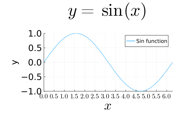
Fonts#
LaTeX fonts are supported by the LaTeXStrings.jl package.
using Plots
using LaTeXStrings

plot(sin, 0, 2π,
    title=L"y = \sin(x)",
    titlefont=font(40), ## title

    xlabel=L"x",
    ylabel="y",
    xguidefontsize=30, ## x-guide
    yguidefontsize=20, ## y-guide
    # guidefontsize=20, ## both x,y-guide

    xtick=(0:0.5:2π, ["\$ $(i) \$" for i in 0:0.5:2π]),
    ytick=-1:0.5:1,
    xtickfontsize=15,
    ytickfontsize=20,
    # tickfontsize=10, ## for both x and y

    label="Sin function",
    legendfontsize=12,

    xlims=(0,2π),
    ylims=(-1,1),
    bottom_margin=5Plots.mm,
    left_margin=10Plots.mm,
    top_margin=15Plots.mm
)
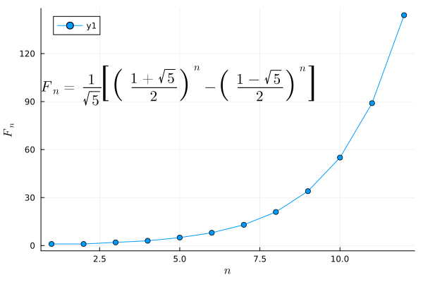
fib(x) = (((1+sqrt(5))/2)^x - ((1-sqrt(5))/2)^x)/sqrt(5)

ann = L"F_n = \frac{1}{\sqrt{5}} \left[\left( \frac{1+\sqrt{5}}{2} \right)^n - \left( \frac{1-\sqrt{5}}{2} \right)^n \right]"

plot(fib, 1:12, marker=:circle, xlabel=L"n", ylabel=L"F_n", annotation=(5, 100, ann))
Bar plots#
using Plots
using StatsPlots
using StatsBase
measles = [38556, 24472, 14556, 18060, 19549, 8122, 28541, 7880, 3283, 4135, 7953, 1884]
mumps = [20178, 23536, 34561, 37395, 36072, 32237, 18597, 9408, 6005, 6268, 8963, 13882]
chickenPox = [37140, 32169, 37533, 39103, 33244, 23269, 16737, 5411, 3435, 6052, 12825, 23332]
ticklabel = string.(collect('A':'L'))
12-element Vector{String}:
 "A"
 "B"
 "C"
 "D"
 "E"
 "F"
 "G"
 "H"
 "I"
 "J"
 "K"
 "L"
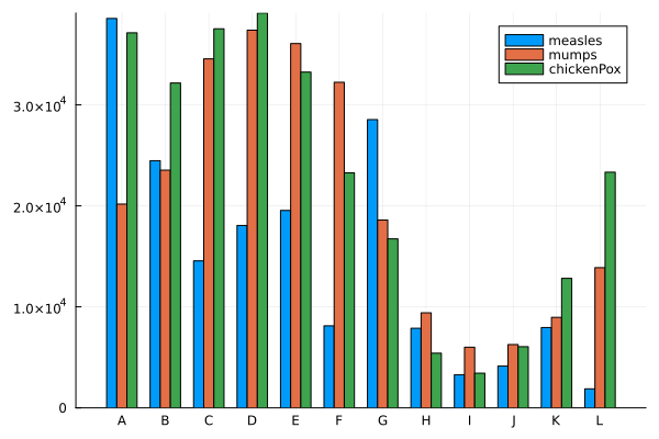
Grouped vertical bar plots#
Requires the StatsPlots.jl package.
groupedbar(data, bar_position = :dodge)
groupedbar([measles mumps chickenPox], bar_position = :dodge, bar_width=0.7, xticks=(1:12, ticklabel), label=["measles" "mumps" "chickenPox"])
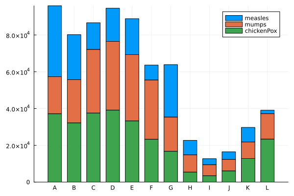
Stacked vertical bar plots#
Requires StatsPlots package.
groupedbar(data, bar_position = :stack)
groupedbar([measles mumps chickenPox],
        bar_position = :stack,
        bar_width=0.7,
        xticks=(1:12, ticklabel),
        label=["measles" "mumps" "chickenPox"])
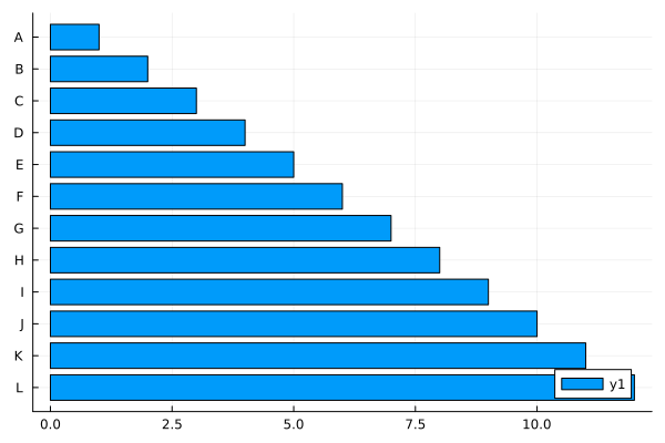
Horizontal Bar Plot#
bar(data, orientation=:h)
bar(1:12, orientation=:h, yticks=(1:12, ticklabel), yflip=true)
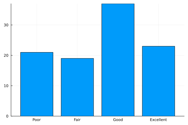
Categorical Histogram Plot#
status = ["Poor", "Fair", "Good", "Excellent"]
data = sample(status, Weights([1,1,2,2]), 100)
datamap = countmap(data)

bar((x -> datamap[x]).(status), xticks=(1:4, status), legend=nothing)
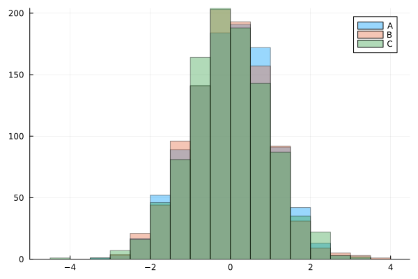
Histogram#
histogram(data, bins=N)
using Plots

x = randn(1000)
y = randn(1000)
z = randn(1000)

histogram(x, bins=20, alpha=0.4, label="A")
histogram!(y, bins=20, alpha=0.4, label="B")
histogram!(z, bins=20, alpha=0.4, label="C")
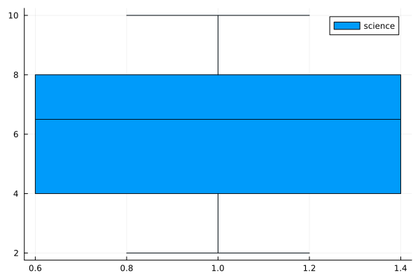
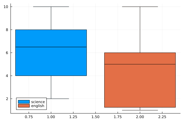
Box plots#
using Plots
using StatsPlots
using Statistics

n = 30
science = rand(1:10, n)
boxplot(science, label="science")
english = rand(1:10, n)
boxplot([science english], label=["science" "english"])
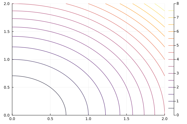
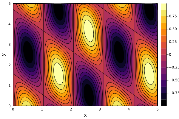
Contour Plots#
Over a function#
contour(xs, ys, f) where z = f(x, y)
using Plots

xs = range(0, stop=2, length=50)
ys = range(0, stop=2, length=50)
f = (x , y) -> x^2 + y^2

contour(xs, ys, f)
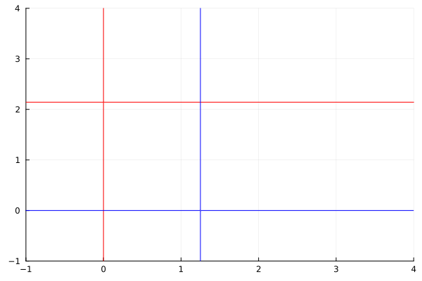
Nullclines#
Nullclines (zero-growth isoclines) are curves where the derivative of one variable is zero. Nullclines are used to analyze evolution and stability of ODE systems.
using Plots

dx = (x, y) -> 3x - 1.4x*y
dy = (x, y) -> -y + 0.8x*y

myrange = -1:0.01:4

contour(myrange, myrange, dx, levels=[0], color=:red, legend=false)
contour!(myrange, myrange, dy, levels=[0], color=:blue, legend=false)
Contour plot over an array#
contour(x1d, y1d, xy2d)
# Notice xs is transposed
# This makes zz a 2D matrix
zz = f.(xs', ys)
contour(xs, ys, zz)
Filled Contour Plots#
contour(xs, ys, f, fill=true)contourf(xs, ys, f)
contour(0:0.01:5, 0:0.01:5, (x, y) -> sin(3x) * cos(x+y), xlabel="x", ylabel="y", fill=true)
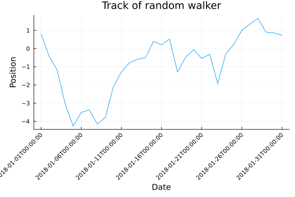
Datetime plot#
Use
Datespackage andDatadata typeCustomize ticks
using Plots
using Dates

days = 31
position = cumsum(randn(days))
x = Date(2018,1,1):Day(1):Date(2018,1,31)
ticks = [x[i] for i in 1:5:length(x)]

plot(x, position,
     xlabel="Date",
     ylabel="Position",
     title="Track of random walker",
	 legend=nothing,
     xticks=ticks,
     xrotation=45,
     bottom_margin=10Plots.mm,
     left_margin=5Plots.mm)
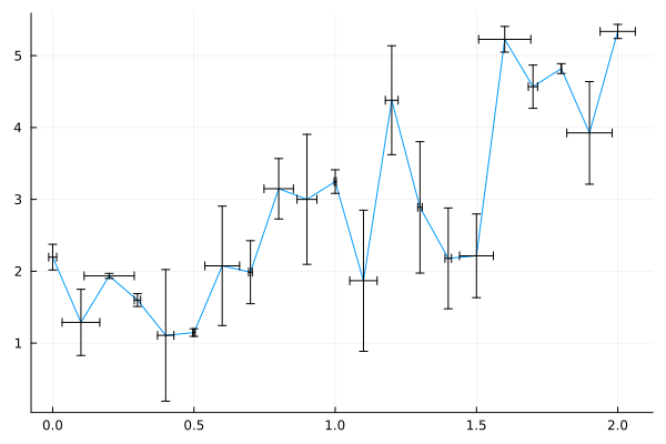
Error bar#
plots(..., xerr=xerr, yerr=yerr)
using Plots

f = x -> 2 * x + 1
x = 0:0.1:2
n = length(x)
y = f.(x) + randn(n)

plot(x, y,
    xerr=0.1 * rand(n),
    yerr=rand(n),
	legend=nothing)
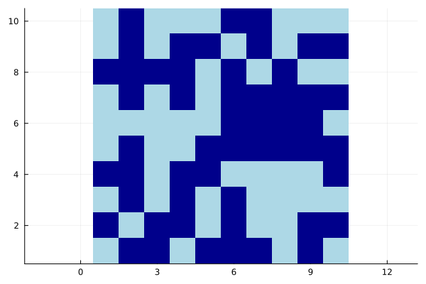
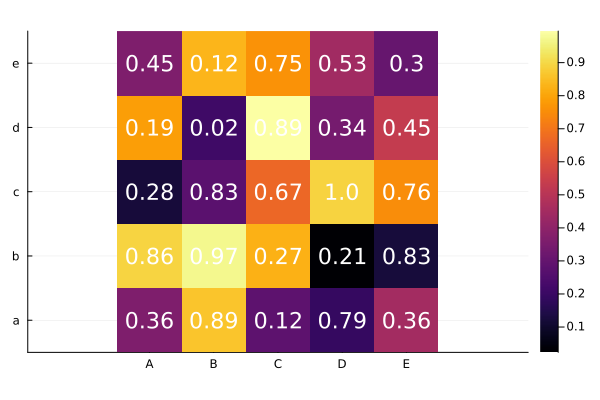
Heatmap#
heatmap(data)
using Plots

a = rand(5,5)
xlabel = string.(collect('A':'E'))
ylabel = string.(collect('a':'e'))
heatmap(a, xticks=(1:5, xlabel),
           yticks=(1:5, ylabel),
           aspect_ratio=:equal)

fontsize = 15
nrow, ncol = size(a)

# Add number annotations to plots
ann = [(i,j, text(round(a[i,j], digits=2), fontsize, :white, :center))
            for i in 1:nrow for j in 1:ncol]

annotate!(ann, linecolor=:white)
Line plots#
using Plots
plot(x, y)
plot(f, xRange)
plot(f, xMin, xMax)
plot(x, [y1 y2])
using Plots

# Data
x = 0:0.1:2pi
y1 = cos.(x)
y2 = sin.(x)

# Creating a plot in steps
plot(x, y1, color="blue", linewidth=3)
plot!(x, y2, color="red", line=:dash)
title!("Trigonometric functions")
xlabel!("angle")
ylabel!("sin(x) and cos(x)")
plot!(xlims=(0,2pi), ylims=(-2, 2), size=(600, 600))
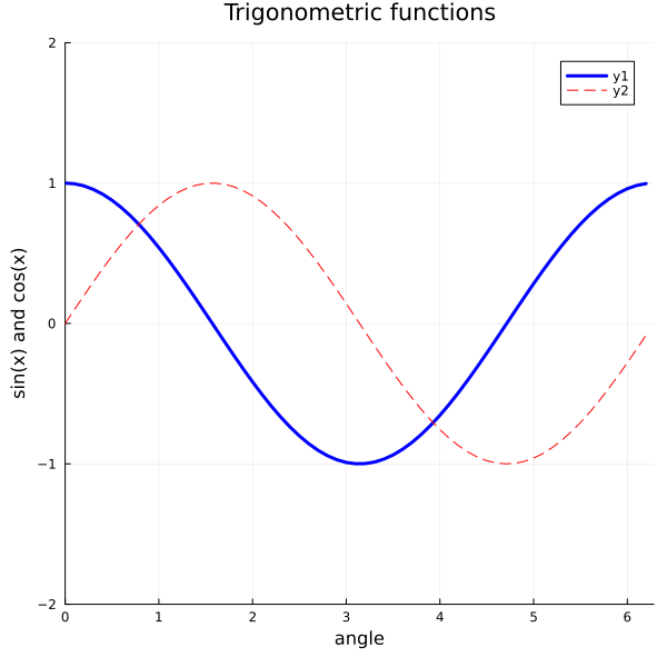
plot(x, y1, line=(:blue, 3))
plot!(x, y2, line=(:dash, :red))

# Use keywords to set the options all in one plot() call
plot!(title="Trigonometric functions",
        xlabel="angle",
        ylabel="sin(x) and cos(x)",
        xlims=(0,2pi), ylims=(-2, 2), size=(600, 600))
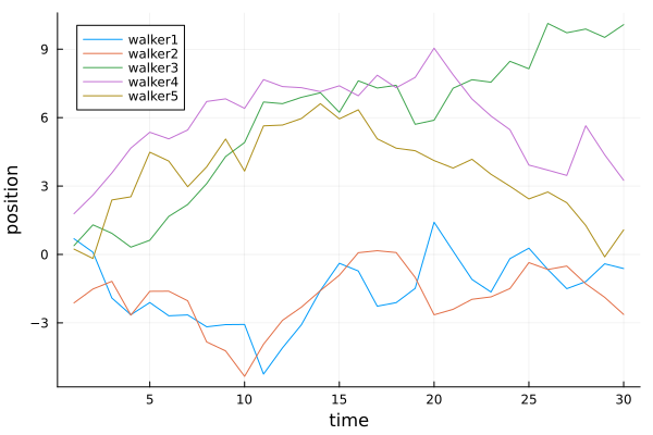
Plotting multiple series#
One row = one observation
One column = one species
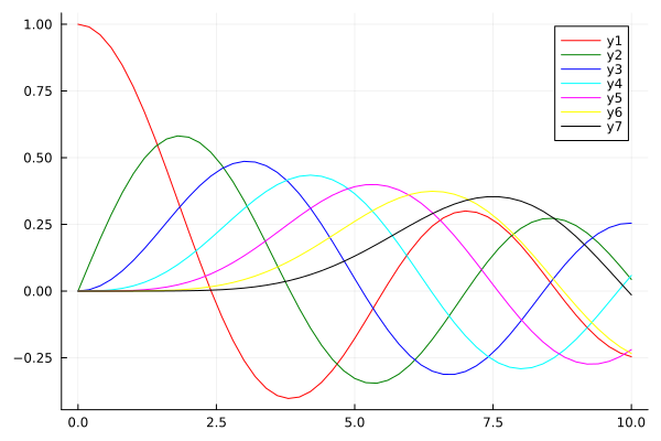
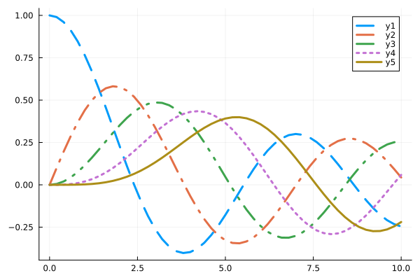
time = 30
walker1 = cumsum(randn(time))
walker2 = cumsum(randn(time))
walker3 = cumsum(randn(time))
walker4 = cumsum(randn(time))
walker5 = cumsum(randn(time))
plot(1:time, [walker1 walker2 walker3 walker4 walker5],
    xlabel="time", ylabel="position",
    label=["walker1" "walker2" "walker3" "walker4" "walker5"],
    legend=:topleft
)
Parametric plots#
Functions can be plotted directly.
plot(f, xmin, xmax)plot(f, range_of_x)plot(fx(t), fy(t), range_of_t)
let
    f = x -> 5exp(-x^2)
    g = x -> x^2
    plot([f, g], -3, 3, label=["f" "g"], legend=:top)
end
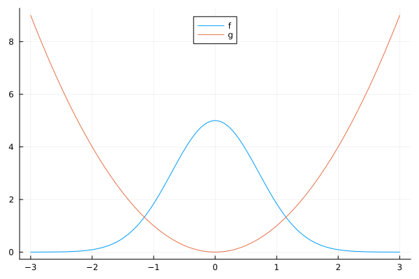
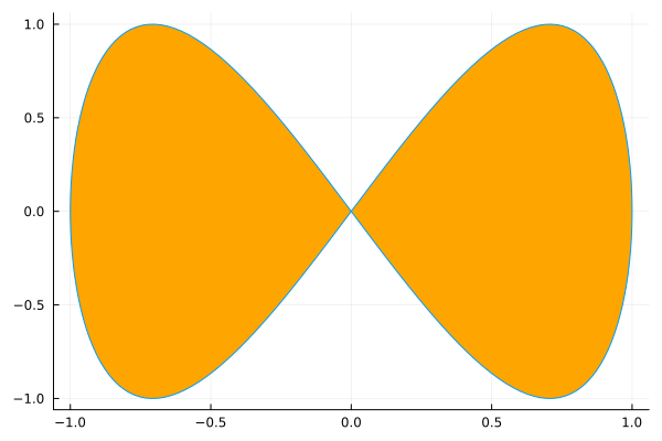
plot(sin, t->sin(2t), 0, 2π, leg=false, fill=(0,:orange))
3D line plot#
Similar to 2D line plots.
plot(fx(t), fy(t), fz(t), tmin, tmax [, kwargs...])
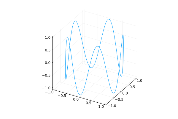
plot(cos, sin, t -> sin(5t), 0, 2pi, legend=nothing)
Line colors#
plot(x, y, c=color)
using Plots
using SpecialFunctions

x = 0:0.2:10
y0 = besselj.(0,x)
y1 = besselj.(1,x)
y2 = besselj.(2,x)
y3 = besselj.(3,x)
y4 = besselj.(4,x)
y5 = besselj.(5,x)
y6 = besselj.(6,x)
colors = [:red :green :blue :cyan :magenta :yellow :black]
plot(x, [y0 y1 y2 y3 y4 y5 y6], c=colors)
Line styles#
using Plots
@show Plots.supported_styles()
Plots.supported_styles() = [:auto, :dash, :dashdot, :dashdotdot, :dot, :solid]
6-element Vector{Symbol}:
 :auto
 :dash
 :dashdot
 :dashdotdot
 :dot
 :solid
style = Plots.supported_styles()[2:end]
style = reshape(style, 1, length(style))
plot(x, [y0 y1 y2 y3 y4], line=(3, style))
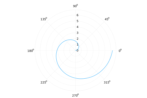
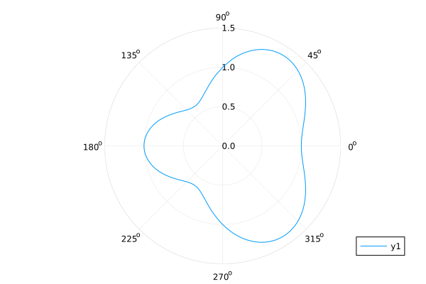
Polar Plots#
plot(θ, r, proj=:polar)
using Plots
plot(θ -> 1 + cos(θ) * sin(θ)^2, 0, 2π, proj=:polar, lims=(0, 1.5))
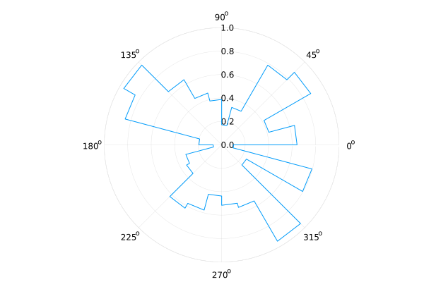
Rose Plots#
plot(..., proj=:polar, line=:steppre)
n = 24
R = rand(n+1)
plot(0:2pi/n:2pi, R, proj=:polar, line=:steppre, lims=(0, 1), legend=nothing)
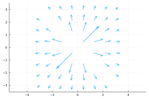
Quiver Plots#
quiver(x1d, y1d, quiver=(vx1d, vy1d)quiver(x2d, y2d, quiver=(x, y)->(u, v))
using Plots

n = 7
f = (x,y) -> hypot(x, y) |> inv

x = repeat(-3:(2*3)/n:3, 1, n) |> vec
y = repeat(-3:(2*3)/n:3, 1, n)' |> vec
vx = f.(x,y) .* cos.(atan.(y,x)) |> vec
vy = f.(x,y) .* sin.(atan.(y,x)) |> vec
quiver(x, y, quiver=(vx, vy), aspect_ratio=:equal)
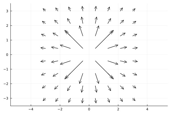
g = (x, y) -> [f(x,y) * cos(atan(y,x)), f(x,y) * sin(atan(y,x))]
xx = [x for y in -3:(2*3)/n:3, x in -3:(2*3)/n:3]
yy = [y for y in -3:(2*3)/n:3, x in -3:(2*3)/n:3]
quiver(xx, yy, quiver=g, aspect_ratio=:equal, color=:black)
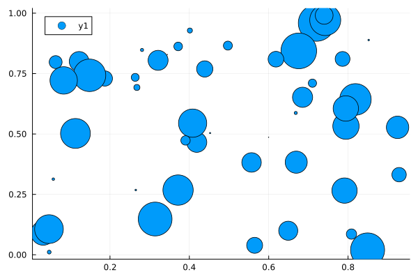
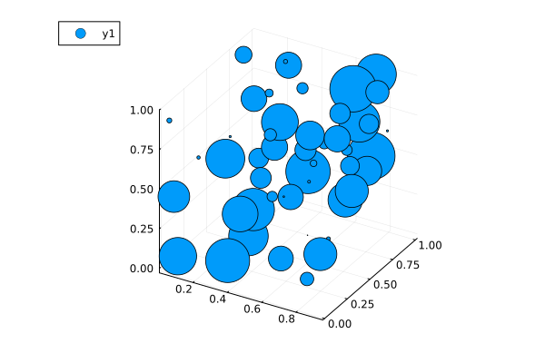
Scatter Plots#
2D Scatter Plots: scatter(xpos, ypos)
using Plots

n = 50
x = rand(n)
y = rand(n)
ms = rand(50) * 30
scatter(x, y, markersize=ms)
3D Scatter Plots: scatter(xpos, ypos, zpos)
scatter(x, y, rand(n), markersize=ms)
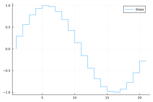
Stairstep plot#
plot(..., line=:steppre)
plot(sin.(0:0.3:2pi), line=:steppre, label="Steps")
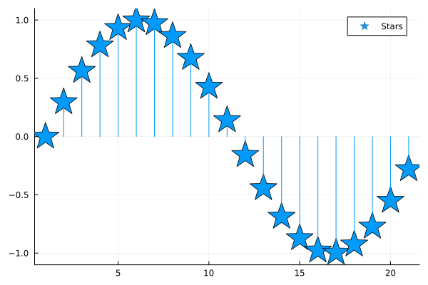
Stem plot#
Known as the lollipop plot.
plot(..., line=:stem)
plot(sin.(0:0.3:2pi), line=:stem, marker=:star, markersize=20, ylims=(-1.1, 1.1), label="Stars")
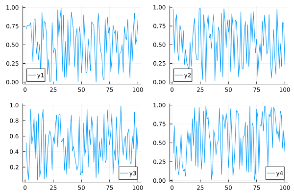
Subplots#
plot(p1, p2, p3, ...)plot(..., layout=(nrow, ncol))plot(..., layout=@layout [...])
using Plots

data = rand(100, 4)
100×4 Matrix{Float64}:
 0.709981   0.973362  0.516176   0.363075
 0.761391   0.388399  0.193247   0.724163
 0.75949    0.815402  0.0369112  0.137228
 0.761702   0.902961  0.330324   0.455833
 0.795277   0.416984  0.945352   0.176323
 0.586307   0.286339  0.499248   0.0763004
 0.276137   0.765012  0.594053   0.294608
 0.84172    0.687983  0.841599   0.620266
 0.847136   0.393362  0.305451   0.216803
 0.380462   0.687962  0.794865   0.127923
 ⋮
 0.378577   0.106089  0.691953   0.777491
 0.0571538  0.977407  0.276459   0.607869
 0.674539   0.610381  0.236658   0.662346
 0.278811   0.179141  0.604079   0.515615
 0.695049   0.514618  0.438862   0.922791
 0.924816   0.210846  0.912419   0.860384
 0.508744   0.798775  0.132198   0.429291
 0.5701     0.786537  0.709826   0.66473
 0.83062    0.233978  0.425281   0.375258
create a 2x2 grid, and map each of the 4 series to one of the subplots
plot(data, layout = 4)
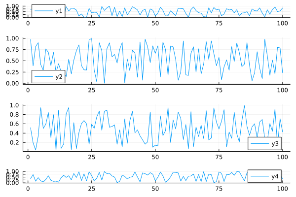
More complex grid layouts can be created with the grid(…) constructor:
plot(data, layout = grid(4, 1, heights=[0.1 ,0.4, 0.4, 0.1]))
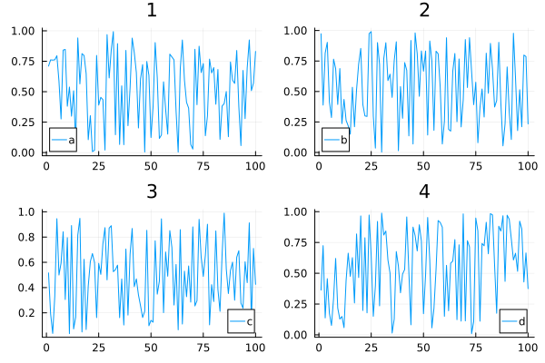
Adding titles and labels
plot(data, layout = 4, label=["a" "b" "c" "d"], title=["1" "2" "3" "4"])
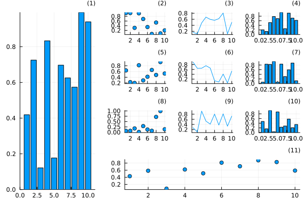
Use @layout macro
l = @layout [
    a{0.3w} [grid(3,3)
             b{0.2h}  ]
]
plot(
    rand(10, 11),
    layout = l, legend = false, seriestype = [:bar :scatter :path],
    title = ["($i)" for j in 1:1, i in 1:11], titleloc = :right, titlefont = font(8)
)
Use _ to ignore a spot in the layout
plot((plot() for i in 1:7)..., layout=@layout([_ ° _; ° ° °; ° ° °]))
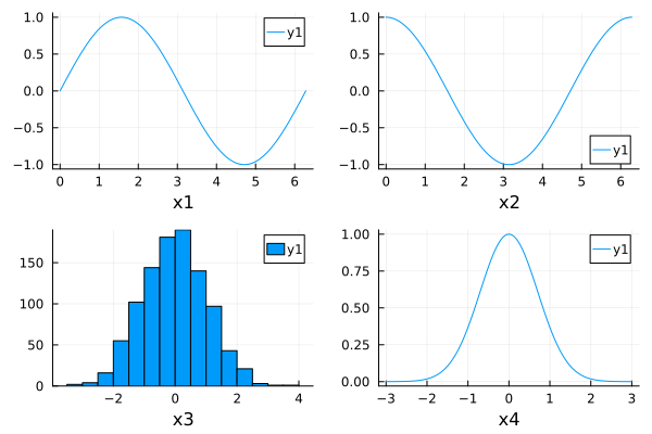
Build subplots one by one#
p1 = plot(sin, 0, 2pi, xlabel="x1")
p2 = plot(cos, 0, 2pi, xlabel="x2")
p3 = histogram(randn(1000), xlabel="x3")
p4 = plot(x->exp(-x^2), -3, 3, xlabel="x4")
plot(p1, p2, p3, p4)
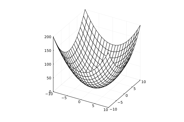
Surface plots#
surface(x, y, z)surface(x, y, (x,y)->z)plot(x, y, z, linetype=:surface)plot(x, y, z, linetype=:wireframe)
using Plots

x = y = -10:10
f = (x , y) -> x^2 + y^2

surface(x, y, f)
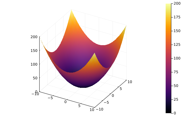
surface style
plot(x, y, f, linetype=:surface)
wireframe style
plot(x, y, f, linetype=:wireframe)
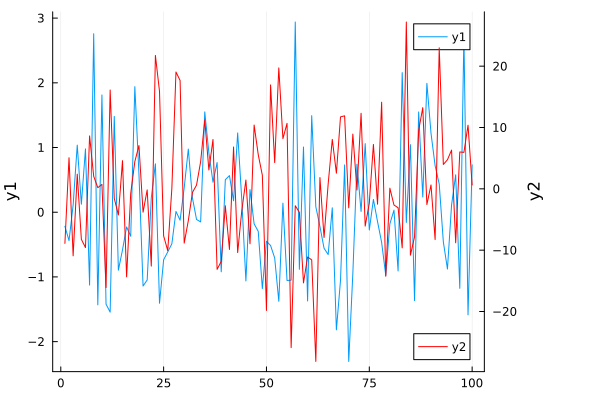
Twin Y Axis#
plot!(twinx())
using Plots

plot(randn(100), ylabel="y1", leg=:topright)
plot!(
    twinx(), randn(100)*10,
    c=:red,
    ylabel="y2",
    leg=:bottomright,
    size=(600, 400)
)
plot!(right_margin=15Plots.mm)
Animations#
using Plots
define the Lorenz attractor
Base.@kwdef mutable struct Lorenz
    dt::Float64 = 0.02
    σ::Float64 = 10
    ρ::Float64 = 28
    β::Float64 = 8/3
    x::Float64 = 1
    y::Float64 = 1
    z::Float64 = 1
end

function step!(l::Lorenz)
    dx = l.σ * (l.y - l.x)
    dy = l.x * (l.ρ - l.z) - l.y
    dz = l.x * l.y - l.β * l.z
    l.x += l.dt * dx
    l.y += l.dt * dy
    l.z += l.dt * dz
end

attractor = Lorenz()
Main.var"##277".Lorenz(0.02, 10.0, 28.0, 2.6666666666666665, 1.0, 1.0, 1.0)
initialize a 3D plot with 1 empty series
plt = plot3d(
    1,
    xlim = (-30, 30),
    ylim = (-30, 30),
    zlim = (0, 60),
    title = "Lorenz Attractor",
    marker = 2,
)

plt
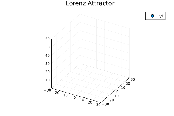
pushing new points to the plot
anim = @animate for i=1:1500
    step!(attractor)
    push!(plt, attractor.x, attractor.y, attractor.z)
end

mp4(anim, fps = 15)
[ Info: Saved animation to /tmp/jl_iBAJUtKRQt.mp4
This notebook was generated using Literate.jl.